Monday, 28 February 2011

Double page spread & TV advert


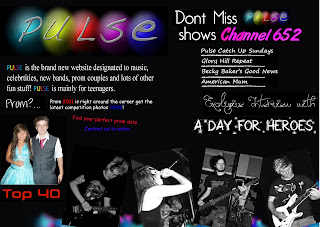
Double page spread
I created my double page spread by firstly filling the background in black. I then inserted my logo which I had already created before hand in PhotoShop which is the same logo I used in my website. I then inserted copyright free images, either taken by me or of photos from friends whom I had permission off.  There are certain font’s for example - Top 40, which I downloaded from dafont.com but then later on edited on PhotoShop. The text just below the logo is telling you about the website launch and how viewers should be interested by it. On the right directly across from this is telling the viewers how they shouldn’t miss out on catching the latest shows by ‘Pulse’, it then tells viewers what TV shows they can watch and at what times. Directly below that then is the pictures of the latest new hot band ‘A Day For Heroes’ the images I have taken myself, with permission off the band, underneath them is a gradient edit, I find this helps make the black and white pictures stand out more for the audience to see. Giving a great effect. To the left of that then is the image of ‘Top 40’ basically telling the viewers that they can view a top 40 page on the ‘Pulse’ website. Above that then is an image of my friends Aimee and Callum at our year 11 prom, I took this photo myself, again indenting to show the viewers that you can view prom couples. What I have included in my double page spread, is to engross the viewers to want to actually view the website. I think  my logo is very eye catching with the different gradient colour edits around each letter. 


Newspaper ad 
I have now finally uploaded a picture of my newspaper ad on here for my Pulse website. I created this on PhotoShop setting the canvas size to width ( ) and height () and resolution to (). I then again set the background colour to black and inserted the same logo I used for my website, which was created on PhotoShop. I wanted to keep my newspaper ad fairly simple, but still effective. I added text with the channel number on, which I also edited in PhotoShop and my website url. I wanted to make that stand out to highlight it for the audience to view Pulse. I also added my own slogan which I created myself, ‘ Can you feel the’ just above the logo. Insisting that the audience must view my website.


Research into content for my website

I have decided from my research and planning that I will have six hyperlinked pages. My website is going to have a homepage, a news page ,a music page, a gallery page and finally a contact page. My home page will basically to let everyone know what my website is about and it will guide you to the surrounding pages. My news page will be based around the latest new band 'A day for heroes' who are a local band in my area, for this I have taken my own images of them, and filmed them during one of their gigs. My music page will let the viewers know about the latest top 40, including singles from 40 right to the top! There will be a top 40 logo right at the top of this page which will include the website page logo 'Pulse'. The gallery page will let the viewers have an insight to the prom couple of the year 2010 and basically to let them vote for prom couple 2011, they can do this by viewing the photos. Lastly is the contact page, showing the viewers how they can get into with 'Pulse' through the channel number and the website address. 


Home Page:
My homepage is going to be the first page the user will see when entering my website, so it needs to give a very good first impression. Within design conventions of any website, the homepage will offer its audience places to go, by which I mean links to the other pages, with images and descriptions next to them to encourage the user to go to that page. 


News Page:
My News page is going to consist of the latest entertainment news, additionally any celebrity gossip (goss) or possibly breaking news which the audience will find interesting. It will also contain the latest new band 'A day for heroes' images of them, a video and an interview. All of these are copyright free as I've asked for permission and some of the images I personally took myself. There is also an option to be linked to the Facebook fan group.The video can be watched after clicking the band picture

Music Page: 
On this page, there will be a collection of the weeks 'must hear' singles, called the top 40 chart. The singles are the latest hot new songs out. At the top of the page will be a logo i created for the top 40 chart, then the pulse logo underneath. All the artist, track, and positions are placed into one big table. 

What's On Page:
This page will tell the viewers about the new show 'Glory hill' and what it has to offer, it will have images of the five cast members and their names, these images I also had permission to use. At the bottom of the page there will be a TV schedule for Saturday and Sunday telling you what shows are on and at what times. The colour scheme is pink and black, the cast images also have different colours around them.

Gallery page:
The gallery page will inform you on how to enter the prom couple competition, it will should you images of the prom couple 2010 couple voted by 'Pulse' viewers. The gallery page will also show you how you can join in by voting for your favourite prom couple 2011, by clicking on the 'contact us' link. The font I have used is mainly from dafont.com where I have edited it to fit in with my colour scheme.